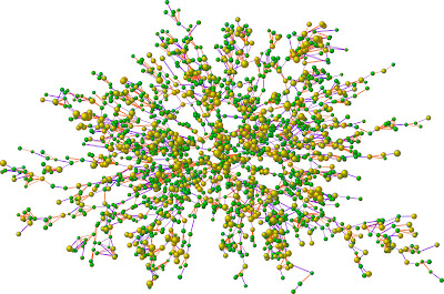
Proportional Circle maps represent a data set by varying the size of a circle to values of the various data. In other words, the greater the value of a particular statistic the larger the circle used to represent that data. The map above is of a social network map of 2,200 people, the largest group of connected individuals in the Framingham Heart Study, in the year 2000.Each circle represents one person, and the size of each circle is proportional to that person's body-mass index (BMI). Yellow circles indicate people who are considered medically obese and green circles indicate people who are not obese. Lines indicate family and friendship ties.


No comments:
Post a Comment