Saturday, May 31, 2008

LIDAR


Light Detection and Ranging, LIDAR, is an optical remote sensing technology that measures light to find range or information about distant objects. The idea is similar to radar where sound is bounced off an object. LIDAR bounces light off an object and measures the time delay between the transmissions. LIDAR can be used to develop a 3-dimensional model like the one in the photo above. LIDAR created this 3-D model of the area around the World Trade Center on Sept. 28, 2001, shortly after the attack on Sept. 11, 2001.

Doppler Radar


Doppler Radars send microwave signals and records the frequency of the returns and can be used among other things to track the speed of things cars (police speed guns). Doppler Radar is more known today for its use in weather maps. Those maps use a variation on the true Doppler technique tracking the speed of precipitation. Oftentimes, the public will confuse Doppler Radar as interchangeable with weather radar. This Doppler Radar effect image is of Hurricane Katrina on Aug. 28, 2005.

Black and White Aerial Photos


Black and white aerial photos were used as part of a low-cost survey to cover the United States. These photos, when collected over several generations, can be used to compare changes to the land surface. This is a photo mosaic of White Mesa, San Ysidro, New Mexico. This area is known for its biking trails and fossil remains.

Infrared Aerial Photo


An infrared aerial photo depicts changes to the environment, the health of forests, wetlands, bays and oceans, monitors damage to roofs, tracks dairy farm out flows, and pinpoints and monitors infestations and pollution. The photo above shows changes in weather patterns similar to cartographic animations. This is Hurricane Felix in September 2007.

Cartographic Animations


Cartographic animations depict visual changes like weather movement. For example the map above, when set in motion, shows the development and movement of Hurricane Katrina over a specific time range.

Cartograms

Cartograms are thematic maps that tell a geographic story about a location. Cartograms are not drawn to scale, but drawn in proportion to the particular information they are trying to depict. For example, the map above shows county by county population in the United States. Each county’s population is represented by shape and color over a map of the physical boundaries of that particular county.

Flow Maps


Flow maps show the movement of objects such as people migrating from one location to the other or the movement of goods being imported or exported. Flow maps, or flow charts, are often used in work places to show the output of materials or work through an organization. The map above shows the pyroclastic (lava) flow and surge deposits from the June 25, 1997, dome collapse and explosion event at Soufriere Hills volcano, Montserrat. The map also shows the various settlement evacuations and damages.

Tuesday, May 27, 2008

Isoline Maps


Isoline maps are another type of thematic map. Isoline maps use line symbols to portray a continuous distribution such as temperature or elevation. Isolines are lines that connect points of equal numeric value. A contour map showing elevation above sea level is a type of isoline map. The map above shows the surface dew point temperature in the United States at a particular point in time. The red areas are the regions where water vapor has saturated the air at the highest levels. The higher the dew point temperature, the more likely the area will experience fog. The lower the dew point, the drier the air and the higher chance for fire danger.

Proportional Circle Maps


Proportional Circle maps represent a data set by varying the size of a circle to values of the various data. In other words, the greater the value of a particular statistic the larger the circle used to represent that data. The map above is of a social network map of 2,200 people, the largest group of connected individuals in the Framingham Heart Study, in the year 2000.Each circle represents one person, and the size of each circle is proportional to that person's body-mass index (BMI). Yellow circles indicate people who are considered medically obese and green circles indicate people who are not obese. Lines indicate family and friendship ties.

Choropleth Maps


Choropleth show measures of geographic variables like population density, race or per-capita income using shades or patterns. Choropleth maps are similar to thematic and statistical maps. Choropleths are the preferred maps for depicting electoral statistics. For example, the map above depicts voter percentage difference in 2004 US presidential election as related to voter turnout. States are shaded to not only show which candidate won the state, but by how high a percentage.

Monday, May 26, 2008

Dot-Distribution Maps


Dot-distribution maps show representations of various quantitative data found within the boundaries of a certain area. Dot-distribution is a form of a thematic map representing usually one specific geographical attribute about an area like population. The map above represents the number of farms in each state in the United States. Though it would be difficult to ascertain how many farms are in a state, a look at this map would tell you which states have a lot of farms and which states do not.

Propaganda Maps


Propaganda maps are used to target a specific audience and influence their beliefs and emotions usually for political purposes. The message can be logical, but is often laced with rhetoric to arouse emotion or prejudice in the targeted audience. The Nazi’s created many propaganda maps to further their goal of eliminating Jews from their country and the world. This map is a Japanese propaganda caricature map from around 1941, depicting a U.S. blockade of Japan from the Philippines.

Hypsometric Maps


Hypsometric maps are a form of topographical maps that represent relief with the use of color. The USGS (United States Geological Survey) produced limited numbers of topographic maps with shaded relief. The map of Yosemite above features airbrushed relief shading produced in 1946. In 1013, the first hypsometric maps were produced using watercolors then pencil, chalk, charcoal and crayon. Once technology improved, they were able to create the maps using printing presses with several plates to each add a dimension to the map. Browns represent mid-tones and greens represent the valleys.

Public Land Survey System


Public Land Survey System (PLSS) is a method used in the United States to identify parcels of land to and record titles and deeds of property. The basic units are township and section. Townships measure six miles on each side and are divided into 36 numbered sections of one square mile each. Each square mile equals 640 acres. In the map shown here you can see each section is subdivided into 16 equal squares of 40 acres. This gave rise to the term “lower 40” based on the location of a plot of property within that section.

Cadastral Map


Cadastral maps represent information about real property within a country or state. A cadastral map will include details of ownership, tenure, location, dimensions and value. This cadastral map is of a neighborhood in Australia.

Thematic Map


A thematic map tells a story about a place. For example, I have included a thematic map of a section of the United States that provides information about the median age in each of the states using a variety of colors to represent a certain age cohort. Thematic maps usually represent one geographical element or attribute for an area.

Topographical Map


A topographic map represents features of the landscape, both man-made and natural, through relief, contour lines and other forms of graphic renderings. I have included a topographic view of the planet Mars’ surface. Through the use of a variety of graphic techniques the map shows craters, low and high points and flat surfaces.

Planimetric Map


A planimetric map is a flat or horizontal representation of an area. It is different from a topographical map because it does not show relief in any detail. Rivers, lakes, mountains, forests, prairies, cities and political or other boundaries are just some of things you might find on a planimetric map. The map I have included is from the Carboniferous geological period during the Pennsylvanian Epoch when the glaciers were high, the sea low and the mountains just starting to build.

Mental Map


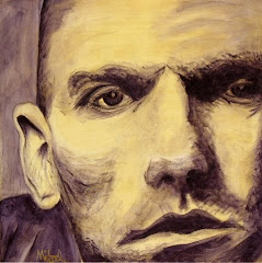
A mental map is an individual’s perception of their world. Every person has an internal view of the world around them. A mental map can be the way each person orders the space around them. Think of the last time you asked directions. Did you understand the directions the person gave you, or did they add a lot of useless knowledge to their directions? A mental map can be a list of things in a person’s world they feel are important, like their favorite musicians. I’ve included a mental map I painted recently of some of my favorite musicians. The musicians, from top left, are: Elton John, Stevie Nicks, Janis Joplin, Kurt Cobain, Johnny Cash, Led Zeppelin, Elvis, Bob Dylan, The Rolling Stones, Michael Stipe, Alanis Morrisette, Jim Morrison, AC/DC, Billy Joel, Chuck Berry, John Lennon, Paul McCartney, Ringo Starr, George Harrison, Bruce Springsteen, The Beatles, Mick Jagger, The Eagles, Bob Seger, Sheryl Crow, Neil Young, Ray Charles, Eric Clapton Tom Petty, Bob Marley, Michael Jackson and Lucinda Williams.

Wednesday, May 14, 2008

DOQQ Map


DOQQ maps or Digital Orthophoto Quandrangle maps are created from aerial photos, which are geometrically altered so they can be used as a map. The photos are often used in GIS software (Geographic Information System). I have linked to the Citrus County (Florida) Property Appraiser's Web site, which uses a GIS system to map all properties in the county. The software allows the user to place lines, text and symbols atop the photos. You can zoom in far enough to see the rooftops of homes or out far enough that shows a PLSS (Public Land Survey System) of Citrus County. The image I have linked to is one magnification from the maximum and shows my neighborhood. My home is outlined in light blue. Florida Avenue is U.S. 41. The Withlacoochee Trail follows the Withlacoochee River for nine miles.

Here is a link to the Web site. The map resets, so to view the area pictured above interactively, visit the following Web site and search for "Arnold Michael."