Tuesday, January 13, 2009
Friday, July 4, 2008
Linked Micromap Plots
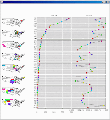
Linked micromap plots link small generalized maps with statistical panels that describe regions; for example showing county estimates on a state by state basis. The linked micromap template was specifically developed to represent spatially indexed statistical summaries. Each plot shows regional names, spatial patterns and statistical patterns while linking them all together. Thus the design is useful for communicating summaries from a host of health and environmental studies.
Range-graded Proportional Circle maps
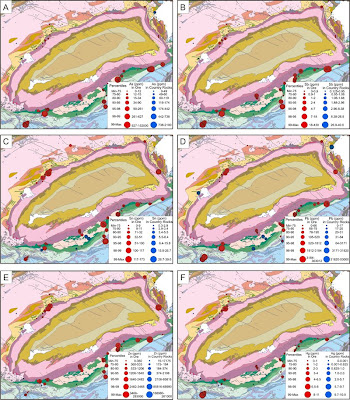
In range-graded proportional circle maps the data is divided into groups using classification procedures common to choropleth mapping. The design goal is for symbol size discrimination, rather than magnitude estimation. The cartographer chooses symbol sizes for adjacent classes so that the map reader can easily distinguish between circle sizes, and therefore, categories. This map shows the abundance of various ore deposits in the area depicted.
Index Value Plot
Similarity Matrix
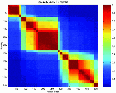
A similarity matrix of scores expresses the similarity between two data points. Similarity matrices are strongly related to their counterparts, distance matrices and substitution matrices. Similarity of Matrix Representations is related to "Diagonal Matrix Representation." Similarity matrices are used in sequence alignment. Higher scores are given to more-similar characters, and lower or negative scores for dissimilar characters. Below is a similarity analysis of the timestamps of digital photographs to cluster photos.
Star Plots
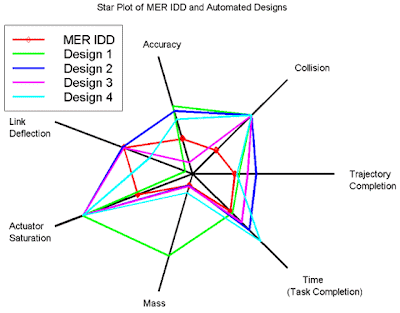
Star plots display multivariate data. Each star represents a single observation. Typically, star plots are generated in a multi-plot format with many stars on each page and each star representing one observation. In this star plot, the center represents the most desirable results. The red line represents the handcrafted MER IDD, and is used for comparison and validation of the approach.
Correlation Matrix
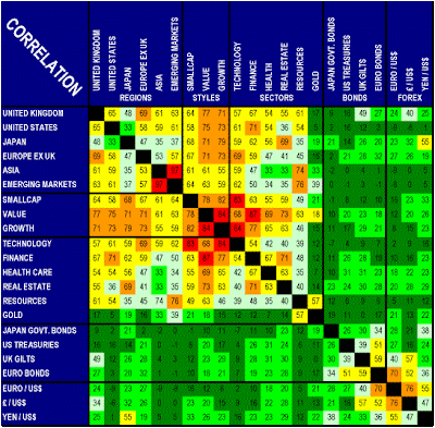
A correlation matrix is a table that can show multiple correlations among multiple cases. This correlation matrix shows the relationships between the principal bond and forex markets as well as equity regions, sectors and investing styles for which Investors RouteMap generates recommendations. Correlation is defined as the proportion to which one market reacts in sympathy with another as measured by monthly price changes in market indices measured in U.S. dollars over the past 15 years. Acute danger is color-coded in red and indicated by high numbers approaching 100%. Falling danger levels are color-coded in the red to green spectrum. Low and negative numbers color-coded in green indicate minimal danger of correlation.
Stem and Leaf Plot
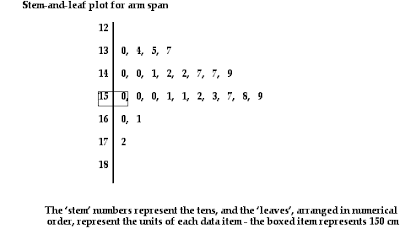
Stem and leaf plot presents quantitative data in a graphical format. They evolved from Arthur Bowley's work in the early 1900s, and are useful tools in exploratory data analysis. A basic stem plot contains two columns separated by a vertical line. The left column contains the stems and the right column contains the leaves. Unlike histograms, stem plots retain the original data to at least two significant digits, and put the data in order.
Tuesday, June 24, 2008
Box Plot
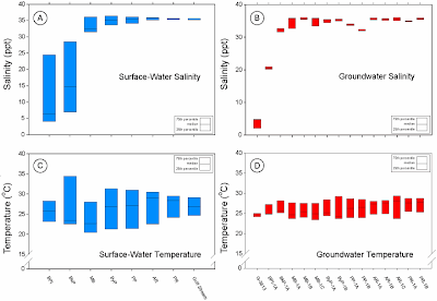
A box plot is a convenient way of graphically depicting groups of numerical data through their five-number summaries (the smallest observation, lower quartile (Q1), median (Q2), upper quartile (Q3), and largest observation). A box plot may also indicate which observations, if any, might be considered outliers. The box plot was invented in 1977 by the American statistician John Tukey. This box plot shows the groundwater characterization and assessment of contaminants in marine areas of Biscayne National Park.
Histogram
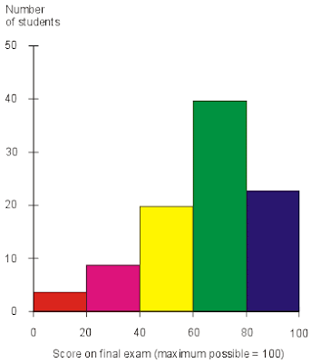
A histogram is a graphical display of tabulated frequencies. It shows what proportion of cases fall into each of several categories. A histogram differs from a bar chart in that it is the area of the bar that denotes the value, not the height, a crucial distinction when the categories are not of uniform width. This histogram shows the results of a final exam given to a hypothetical class of students. Each score range is denoted by a bar of a certain color. If this histogram were compared with those of classes from other years that received the same test from the same professor, conclusions might be drawn about intelligence changes among students over the years. Conclusions might also be drawn concerning the improvement or decline of the professor's teaching ability with the passage of time. If this histogram were compared with those of other classes in the same semester who had received the same final exam but who had taken the course from different professors, one might draw conclusions about the relative competence of the professors.
Parallel Coordinate Graph

A parallel coordinate graph is used to plot large multivariate datasets. Each variable in the data plot is represented as its own Y Axis on the graph. A maximum point for each Y axis is selected, and they are scaled relatively to each other so that each variable takes up the same area in the graph space. In this graph, each Y axis is labeled with a particular baseball statistic. The value labeled at the top of each Y axis represents the player with the highest value in that category. A scaling factor is applied to the y value in an (x,y) point, so that all of the statistics are relative in value to each other in the graph.
Triangular Plot
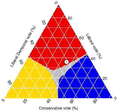
Triangular plot is a barycentric plot on three variables which sum to a constant. It graphically depicts the ratios of the three variables as positions in an equilateral triangle. It is used in petrology, mineralogy, metallurgy, and other physical sciences to show the compositions of systems composed of three species. In population genetics, it is often called a de Finetti diagram. In game theory, it is often called a simplex plot. The axes of the figure show the estimated fraction of the United Kingdom population intending to vote for each of the major parties; the white circle shows the current estimate from opinion polls. The colored areas show the regions of the plot in which - under the assumption of uniform national swing - each of the corresponding major parties would win a majority in Parliament.
Windrose
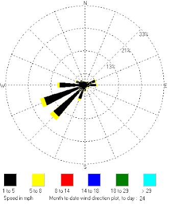
Windrose is a graphic tool used by meteorologists to give a succinct view of how wind speed and direction are typically distributed at a particular location. Presented in a circular format, the wind rose shows the frequency of winds blowing from particular directions. The length of each "spoke" around the circle is related to the frequency that the wind blows from a particular direction per unit time. Each concentric circle represents a different frequency, emanating from zero at the center to increasing frequencies at the outer circles. A wind rose plot may contain additional information, in that each spoke is broken down into color-coded bands that show wind speed ranges. Wind roses typically use 16 cardinal directions, such as north (N), NNE, NE, etc., although they may be subdivided into as many as 32 directions. This Windrose displays a sample of a monthly view of wind speeds in Round Rock, Texas.
Climograph
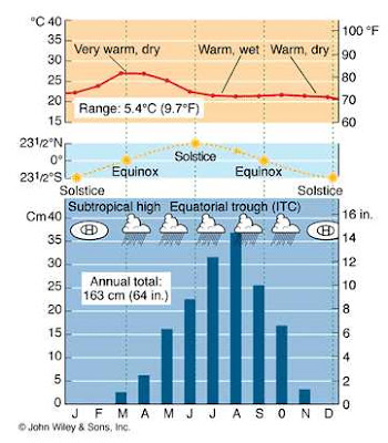
A climograph is a graphical depiction of the monthly precipitation and temperature conditions for a selected place. Precipitation is shown by the bar graph. A line graph depicts temperature. This climograph shows the wet-dry tropical/tropical savanna climate of Timbo, Guinea, at lat. 10 N, West Africa.
Population Profiles
Scatterplot
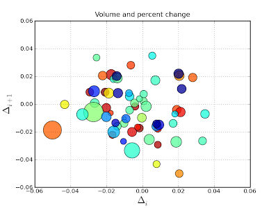
Scatterplot is a type of display that contains one or more scatter plots each of which use Cartesian coordinates to display values for two variables for a set of data. The data is displayed as a collection of points, each having the value of one variable determining the position on the horizontal axis and the value of the other variable determining the position on the vertical axis. This is an example of a scatter plot with (optional) size and color arguments. This example plots changes in Intel's stock price from one day to the next with the sizes coding trading volume and the colors coding price change in day 1.
Accumulative Line Graph or Lorenz Curve
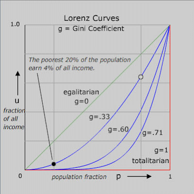
Accumulative line graph or Lorenz curve is a graphical representation of the cumulative distribution function of a probability distribution. It was developed by Max O. Lorenz in 1905 for representing income distribution. A set of idealized Lorenz curves are shown in the figure. The sloping straight green line is the Lorenz curve of an idealized perfectly egalitarian society - where everybody has exactly the same income. The red Lorenz curve - horizontal and then vertical - is that for the extreme authoritarian or totalitarian society where one person has all the income. Curves for societies with intermediate income distributions are shown. The meaning of the curves is illustrated by giving the meaning of one point (black) on one of the curves. The open circle point on the same curve has the coordinates: 80% of the population earns 64% of the income.
Bilateral Graphs
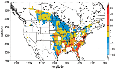
Bilateral graphs show increases on one side of a zero line and decreases on the other side. Use bilateral graphs whenever data to be presented have both positive and negative values. In this bilateral graph, positive and negative values (in %) indicate an increase or decrease, respectively, in soil carbon sequestration occurring between 1981 and 2000 because of changes in climate and the atmospheric CO2 concentration.
Univariate Choropleth maps
Isopachs
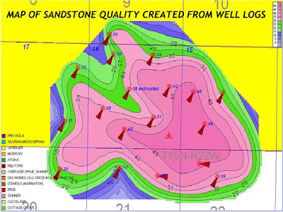
Isopachs are maps of the areal extent and thickness variation of a stratigraphic unit; used in geological exploration for oil and for underground structural analysis. In this map, the petroleum geologist contours the thickness of an individual sandstone. This sandstone is about 45 feet thick in the middle and thins to 20 feet or less around the edges of the gas field.
Remote Sensing KLM file
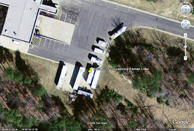
http://ecotronics.com/google-earth/kmldata/nasa.kml
This is a KML remote sensing image of the NASA GSFC Scanning Raman Lidar. The Code 613.1 Raman Lidar group designs, builds, operates and maintains instrumentation for studying various atmospheric processes and constituents. Among these instruments are two that are designed primarily for use in field campaign activities. These instruments are: Scanning Raman Lidar (SRL); Raman Airborne Spectroscopic Lidar (RASL).
Sunday, June 8, 2008
Bivariate Choropleths
Unclassed Choropleth
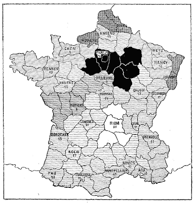
An unclassed choropleth is designed to show statistical data in a multi-colored value moving from smallest to largest, using lighter colors to portray smaller values and using progressively darker shades to portray progressively greater values. The map above shows the rates of illiteracy in
Classed Choropleth
Digital Elevation Models (DLMs)
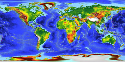
Digital Elevation Models (DLMs) are digital representations of ground surface topography or terrain. A DEM can be represented as a raster (a grid of squares) or as a triangular irregular network. DEMs are commonly built using remote sensing techniques. They may also be built from land surveying. De Montfort University generated a Global Digital Elevation Model at 30 arcseconds resolution by combining the best available ground truth with a unique global database of ERS-1 satellite altimeter derived heights, reprocessed with a novel expert system. This model, ACE, presents radically improved spatial accuracy and resolution over large regions of the globe, in particular over Africa and South America, suffering so far from a drastic lack of in situ data.
Digital Line Graphs (DLGs)
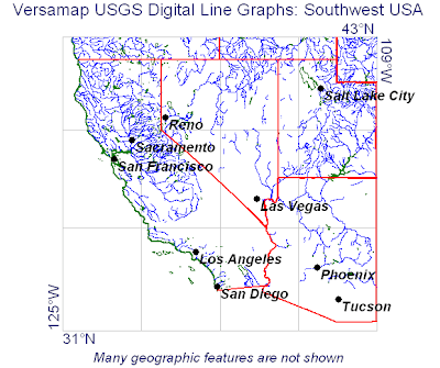
Digital Line Graph (DLGs) are digital vector representations of cartographic information derived from USGS maps and related sources. The USGS produces three primary types of DLG data: Large-Scale (7.5-minute) DLGs correspond to the USGS 1:20,000-, 1:24,000-, and 1:25,000-scale topographic quadrangle maps. They are primarily cast to the Universal Transverse Mercator (UTM) projection system, but some are cast to the State Plane coordinate system. They are referenced to either the North American Datum (NAD) of 1927 (NAD27) or the NAD of 1983 (NAD83). Above, the map of the
Digital Raster Graphics (DRG)
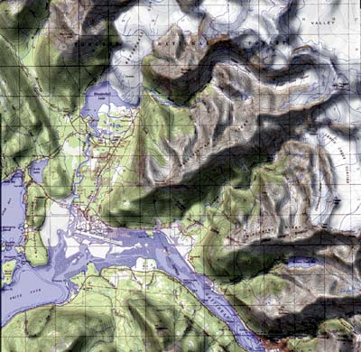
Digital raster graphic (DRG) is a digital image resulting from scanning a paper USGS topographic map for use on a computer. DRGs created by USGS are typically scanned at 250 dpi and saved as a TIFF. The raster image usually includes the original border information, referred to as the "map collar". The map file is UTM projected and georeferenced to the surface of the earth. DRG's are regularly used in GIS applications. Shaded relief generated from raster elevation data effectively portrays the land surface, shown above in combination with the topographic map content from the USGS digital raster graphic of
Isopleths
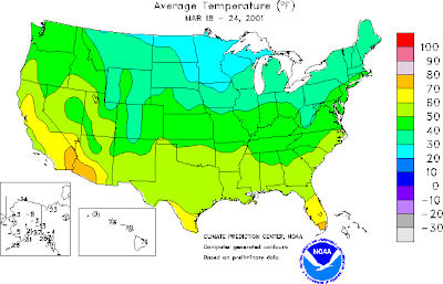
An isopleths is a feature of meteorological charts, connecting points which have an equal value of some variable at a given time and spatial area. The particular variables shown on a given chart may include values such as pressure, temperature, wind speed, etc. They are used to assist in visualizing the general features of a meteorological "field” such as an isobars or isotherms. Above, the map shown features isotherm lines showing temperatures in the
Isohyets
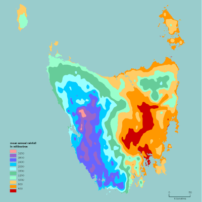
Isohyets are lines drawn on a map connecting points that receive equal amounts of rainfall. Above, the map shows the prevailing westerly airflow over Tasmania from the Southern Ocean that is generally moisture-laden. When it is forced to rise over the western, central and southern highlands, it cools and releases much of its moisture as rain (and snow). By the time the air flow gets to the eastern side of the State, it has reduced most of is moisture, and the chance of rain is reduced. Hence, there is a marked difference in average cloudiness and rainfall across the state.
Isotachs
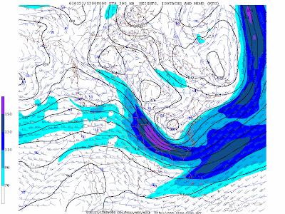
Isotachs are lines of equal wind speed drawn on weather maps. They are helpful in finding maxima and minima in the wind pattern. Minima in the wind pattern aloft are favorable for tropical cyclogenesis. Maximum in the wind pattern at various levels of the atmosphere show locations of jet streams. The map above is an example of isotachs.
Isobars
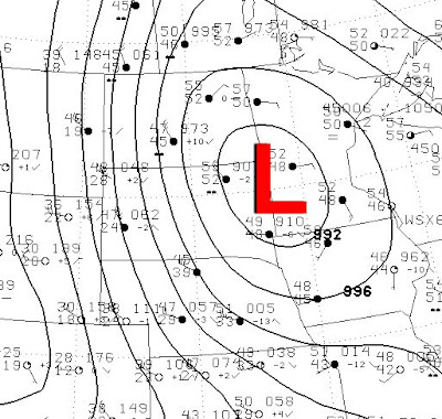
An isobar is a curve connecting values of equal pressure. On May 6, 1999, the wind blew hard across western
Saturday, May 31, 2008
LIDAR
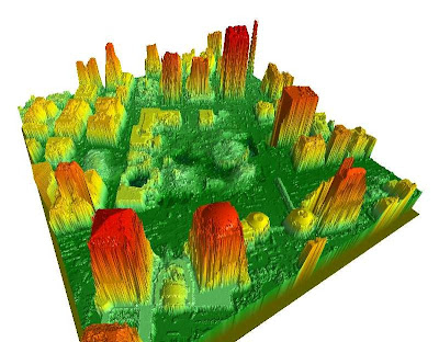
Light Detection and Ranging, LIDAR, is an optical remote sensing technology that measures light to find range or information about distant objects. The idea is similar to radar where sound is bounced off an object. LIDAR bounces light off an object and measures the time delay between the transmissions. LIDAR can be used to develop a 3-dimensional model like the one in the photo above. LIDAR created this 3-D model of the area around the
Doppler Radar

Doppler Radars send microwave signals and records the frequency of the returns and can be used among other things to track the speed of things cars (police speed guns). Doppler Radar is more known today for its use in weather maps. Those maps use a variation on the true Doppler technique tracking the speed of precipitation. Oftentimes, the public will confuse Doppler Radar as interchangeable with weather radar. This Doppler Radar effect image is of Hurricane Katrina on Aug. 28, 2005.
Black and White Aerial Photos
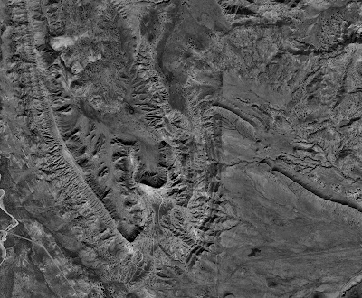
Black and white aerial photos were used as part of a low-cost survey to cover the
Infrared Aerial Photo
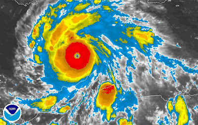
An infrared aerial photo depicts changes to the environment, the health of forests, wetlands, bays and oceans, monitors damage to roofs, tracks dairy farm out flows, and pinpoints and monitors infestations and pollution. The photo above shows changes in weather patterns similar to cartographic animations. This is Hurricane Felix in September 2007.
Cartographic Animations
Cartograms
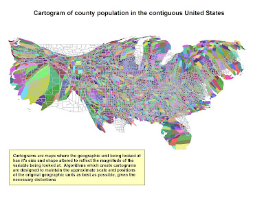 Cartograms are thematic maps that tell a geographic story about a location. Cartograms are not drawn to scale, but drawn in proportion to the particular information they are trying to depict. For example, the map above shows county by county population in the
 Flow Maps
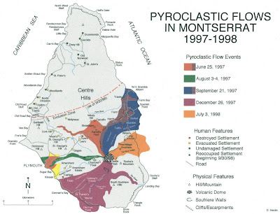
Flow maps show the movement of objects such as people migrating from one location to the other or the movement of goods being imported or exported. Flow maps, or flow charts, are often used in work places to show the output of materials or work through an organization. The map above shows the pyroclastic (lava) flow and surge deposits from the June 25, 1997, dome collapse and explosion event at Soufriere Hills volcano,
Tuesday, May 27, 2008
Isoline Maps
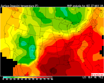
Isoline maps are another type of thematic map. Isoline maps use line symbols to portray a continuous distribution such as temperature or elevation. Isolines are lines that connect points of equal numeric value. A contour map showing elevation above sea level is a type of isoline map. The map above shows the surface dew point temperature in the
Proportional Circle Maps
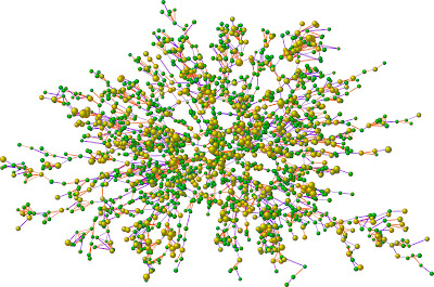
Proportional Circle maps represent a data set by varying the size of a circle to values of the various data. In other words, the greater the value of a particular statistic the larger the circle used to represent that data. The map above is of a social network map of 2,200 people, the largest group of connected individuals in the Framingham Heart Study, in the year 2000.Each circle represents one person, and the size of each circle is proportional to that person's body-mass index (BMI). Yellow circles indicate people who are considered medically obese and green circles indicate people who are not obese. Lines indicate family and friendship ties.
Choropleth Maps
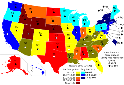
Choropleth show measures of geographic variables like population density, race or per-capita income using shades or patterns. Choropleth maps are similar to thematic and statistical maps. Choropleths are the preferred maps for depicting electoral statistics. For example, the map above depicts voter percentage difference in 2004 US presidential election as related to voter turnout. States are shaded to not only show which candidate won the state, but by how high a percentage.
Monday, May 26, 2008
Dot-Distribution Maps
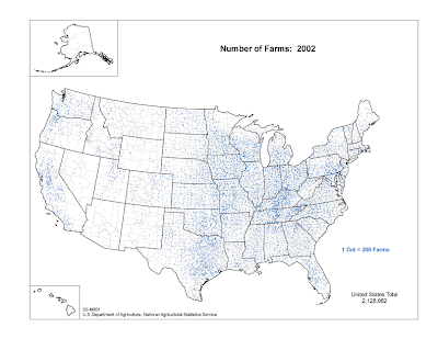
Dot-distribution maps show representations of various quantitative data found within the boundaries of a certain area. Dot-distribution is a form of a thematic map representing usually one specific geographical attribute about an area like population. The map above represents the number of farms in each state in the
Propaganda Maps
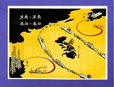
Propaganda maps are used to target a specific audience and influence their beliefs and emotions usually for political purposes. The message can be logical, but is often laced with rhetoric to arouse emotion or prejudice in the targeted audience. The Nazi’s created many propaganda maps to further their goal of eliminating Jews from their country and the world. This map is a Japanese propaganda caricature map from around 1941, depicting a
Hypsometric Maps
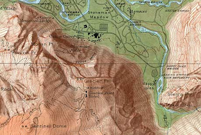
Hypsometric maps are a form of topographical maps that represent relief with the use of color. The USGS (United States Geological Survey) produced limited numbers of topographic maps with shaded relief. The map of
Public Land Survey System
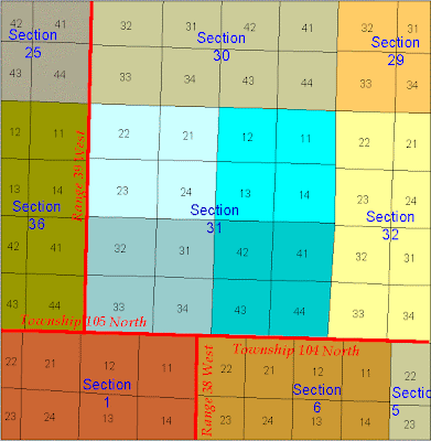
Cadastral Map
Thematic Map
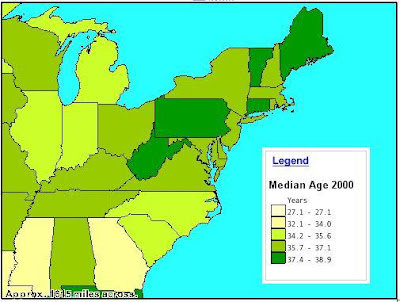
A thematic map tells a story about a place. For example, I have included a thematic map of a section of the
Topographical Map
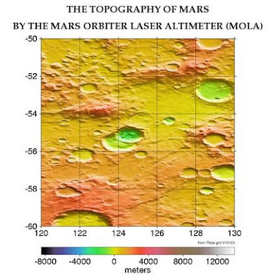
A topographic map represents features of the landscape, both man-made and natural, through relief, contour lines and other forms of graphic renderings. I have included a topographic view of the planet Mars’ surface. Through the use of a variety of graphic techniques the map shows craters, low and high points and flat surfaces.
Planimetric Map
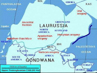
A planimetric map is a flat or horizontal representation of an area. It is different from a topographical map because it does not show relief in any detail. Rivers, lakes, mountains, forests, prairies, cities and political or other boundaries are just some of things you might find on a planimetric map. The map I have included is from the Carboniferous geological period during the Pennsylvanian Epoch when the glaciers were high, the sea low and the mountains just starting to build.
Mental Map

A mental map is an individual’s perception of their world. Every person has an internal view of the world around them. A mental map can be the way each person orders the space around them. Think of the last time you asked directions. Did you understand the directions the person gave you, or did they add a lot of useless knowledge to their directions? A mental map can be a list of things in a person’s world they feel are important, like their favorite musicians. I’ve included a mental map I painted recently of some of my favorite musicians. The musicians, from top left, are: Elton John, Stevie Nicks, Janis Joplin, Kurt Cobain, Johnny Cash, Led Zeppelin, Elvis, Bob Dylan, The Rolling Stones, Michael Stipe, Alanis Morrisette, Jim Morrison, AC/DC, Billy Joel, Chuck Berry, John Lennon, Paul McCartney, Ringo Starr, George Harrison, Bruce Springsteen, The Beatles, Mick Jagger, The Eagles, Bob Seger, Sheryl Crow, Neil Young, Ray Charles, Eric Clapton Tom Petty, Bob Marley, Michael Jackson and Lucinda Williams.
Wednesday, May 14, 2008
DOQQ Map
