Friday, July 4, 2008

Linked Micromap Plots


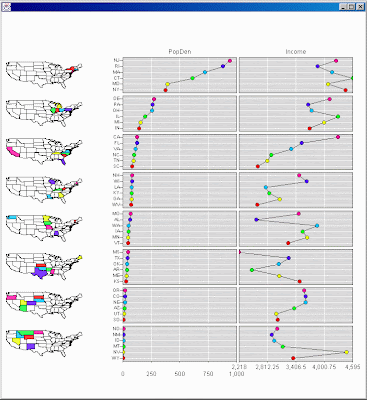
Linked micromap plots link small generalized maps with statistical panels that describe regions; for example showing county estimates on a state by state basis. The linked micromap template was specifically developed to represent spatially indexed statistical summaries. Each plot shows regional names, spatial patterns and statistical patterns while linking them all together. Thus the design is useful for communicating summaries from a host of health and environmental studies.
Range-graded Proportional Circle maps


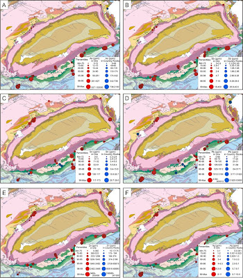
In range-graded proportional circle maps the data is divided into groups using classification procedures common to choropleth mapping. The design goal is for symbol size discrimination, rather than magnitude estimation. The cartographer chooses symbol sizes for adjacent classes so that the map reader can easily distinguish between circle sizes, and therefore, categories. This map shows the abundance of various ore deposits in the area depicted.

Index Value Plot


An index value plot is a way of showing the relativity of all values to an indexed value. This chart shows wide swings, generally corresponding with the cycles of boom and bust in the overall stock market.

Similarity Matrix


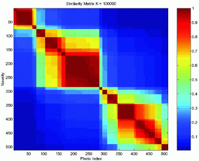
A similarity matrix of scores expresses the similarity between two data points. Similarity matrices are strongly related to their counterparts, distance matrices and substitution matrices. Similarity of Matrix Representations is related to "Diagonal Matrix Representation." Similarity matrices are used in sequence alignment. Higher scores are given to more-similar characters, and lower or negative scores for dissimilar characters. Below is a similarity analysis of the timestamps of digital photographs to cluster photos.

Star Plots


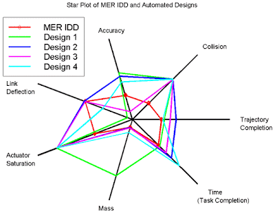
Star plots display multivariate data. Each star represents a single observation. Typically, star plots are generated in a multi-plot format with many stars on each page and each star representing one observation. In this star plot, the center represents the most desirable results. The red line represents the handcrafted MER IDD, and is used for comparison and validation of the approach.

Correlation Matrix


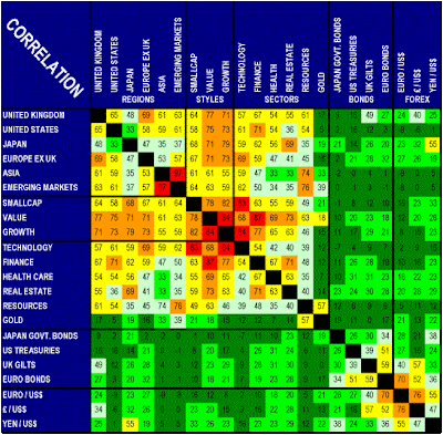
A correlation matrix is a table that can show multiple correlations among multiple cases. This correlation matrix shows the relationships between the principal bond and forex markets as well as equity regions, sectors and investing styles for which Investors RouteMap generates recommendations. Correlation is defined as the proportion to which one market reacts in sympathy with another as measured by monthly price changes in market indices measured in U.S. dollars over the past 15 years. Acute danger is color-coded in red and indicated by high numbers approaching 100%. Falling danger levels are color-coded in the red to green spectrum. Low and negative numbers color-coded in green indicate minimal danger of correlation.

Stem and Leaf Plot


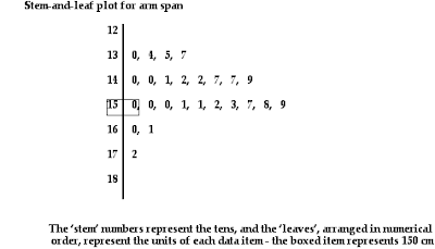
Stem and leaf plot presents quantitative data in a graphical format. They evolved from Arthur Bowley's work in the early 1900s, and are useful tools in exploratory data analysis. A basic stem plot contains two columns separated by a vertical line. The left column contains the stems and the right column contains the leaves. Unlike histograms, stem plots retain the original data to at least two significant digits, and put the data in order.